In a world of smartphones and mobile web, HTML tables are creatures that must be approached with caution. We want you to use tables conservatively and with full knowledge of what choosing to do so will mean for your site.
It's important to evaluate why you think a table is appropriate and consider whether any other option would still achieve the same goal of communicating your information.
Reasons to avoid tables
- Using tables to achieve a certain layout or image placement is always wrong. If you're trying to accomplish a certain look or feel with your page and you aren't able to figure it out without resorting to a table, contact us first for assistance at sitefarm@ucdavis.edu.
- Tables are not as SEO-friendly. Search engine algorithms look for human-readable content and rank it higher than content placed in tables.
- Content in a table may not display until the entire table has loaded, giving users a delay of a second or two before the content appears.
- Tables can create accessibility issues for people who rely on screen readers to navigate and interact with the content on your site.
The ONLY Reason to use tables
- Displaying tabular data of an alpha-numeric nature in rows and columns to achieve maximum effect and comprehension.
Best Practices
- To create an ideal presentation and give the table as much space as possible, avoid using sidebars in the same horizontal row. E.g.: a table in the Content region and a Focal link block in the Sidebar region.
- Use tables in the default space and not hidden within accordions.
Creating a Table
If, after reading through the points above, you decide a table is an appropriate choice for your content, then here are the steps to include one:
- Inside the WYSIWYG section of your content type, select the Show More menu » Table icon:
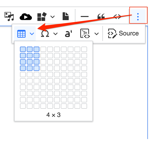
Hover over the column/row selector to designate the size of your table and then click your mouse in the last square or hit your Return/Enter key to generate the table on the page. A menu will be available to you at the bottom of your table that includes the following options:
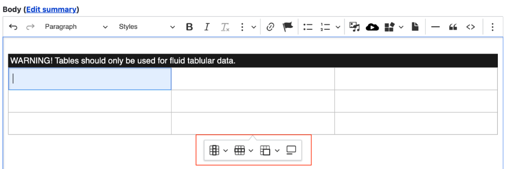
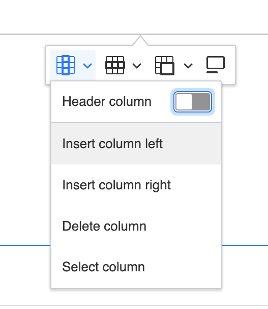
Column properties menu
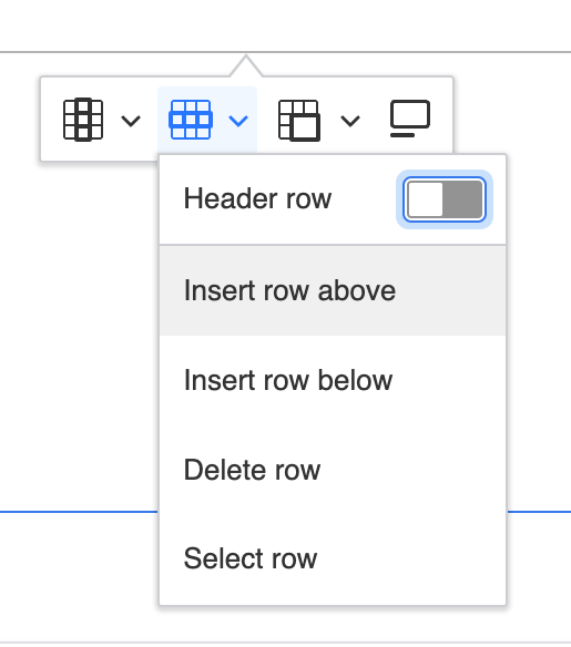
Row properties menu
Merge cell options menu
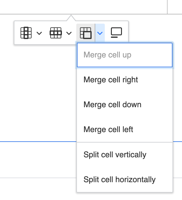
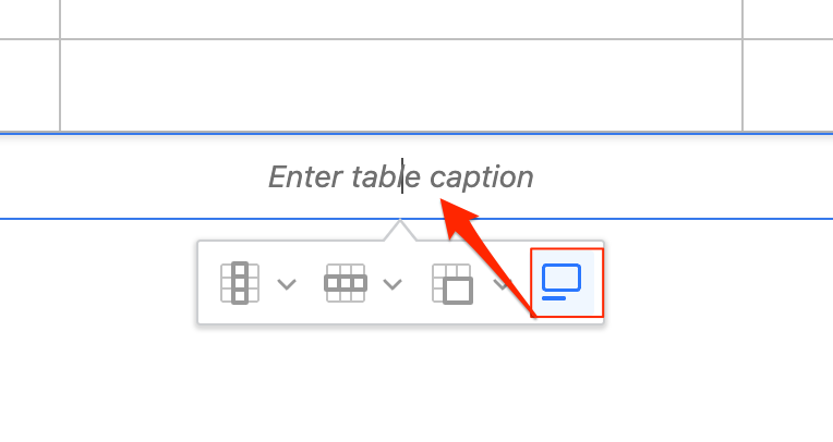
Table caption
- Apply a Header Column or Header Row by clicking into an affected cell and toggling on the column or row button from the appropriate menu.
- TABLE CAPTIONS ARE REQUIRED. While the system does not force you to include one, it is nonetheless required to meet accessibility requirements. Screen readers look for this information to help describe the nature of the table to the person using the reader so they can decide if they want to invest time in the table content or move on to the next section of the page.
- Your table structure will appear in the WYSIWYG region and will include a warning message that reads, "WARNING: Tables should only be used for fluid tabular data." This message will NOT appear on your published page; this is a warning message for you, the user.
Table Demo
| Column 1 title | Column 2 title |
|---|---|
| Lorem ipsum dolor sit amet | Aenean massa. Cum sociis natoque penatibus et magnis dis parturient montes |
| In enim justo, rhoncus ut, imperdiet a, venenatis vitae, justo. Lorem ipsum dolor sit amet, consectetur adipiscing elit, sed do eiusmod tempor incididunt ut labore et dolore magna aliqua. Ut enim ad minim veniam, quis nostrud exercitation ullamco laboris nisi ut aliquip ex ea commodo consequat. | Aenean vulputate eleifend tellus. |
Table Styles
By using the Styles menu in your WYSIWYG you can apply a handful of pre-created styles to your table, providing basic options for borders, row stripes, and border colors. In all cases, the each cell's vertical alignment should have the text begin at the top of the cell regardless of how much text is in any cell in the same row.
Apply a table style
- Click into a cell inside of your targeted table.
- From your WYSIWYG bar, click on the Style menu located on the second row, on the left side.
- Select one of the following table style options, which you can preview on Patternlab:
- Complete the style application by clicking your page or block's Save button.
Smart Device Responsive
As of the 2021 Redesign, tables will now be horizontally responsive. If the width of the table exceeds the width of the device's sceen (smartphones, tablets), a scrollbar will appear to let users slide the screen back and forth to view the other table cells. A visual cue in the form of a vertical shadow will indicate more of the table exists and is available to be viewed.