Resources
- Official campus branding guide
- Color palette
- SiteFarm Color Mapping - old colors to new colors
- Accessible color palette combinations (PDF)
- UC Davis Photos
Zoom Recordings
- Redesign II Discussion - May 27, 2021
Anthony Horn - Redesign Demonstration - Mar 25, 2021
pw: ?#%YHuS6
Anthony Horn
UPDATE: Wed, June 23, 2021
Latest:
- Official rollout date is July 10, 2021 (a Saturday). Look for the new theme to be on your site by Monday morning.
- Tables will be responsive on smaller devices
---
Beginning March 22, 2021 we will be giving SiteFarm users with live, published sites the opportunity for a sneak peek at how their site will look in the new design. Copies of the live sites will be added to our Dev server environment and, via email in our SiteFarm mailing list (please subscribe to receive updates if you haven't already!), we'll provide the URL to access your site(s).
This overview is intended to give you a roadmap to the changes to be implemented in the redesign. Currently, our Dev refresh is scheduled to begin May 17th, 2021 and the redesign release will be rolled out in July 10, 2021.
What’s with everything looking so… Big?
The old way
The old design had a very interesting problem in that the design had a tendency to not look so great at different screen sizes. This was problematic for editors creating layouts that looked good for them on their specific screen without realizing that it was creating an unpleasant experience for others with different screen sizes. For example, when looking at the current design with a screen size of 1100px vs a 4K screen, there can be a stark difference in readability.
Before, to make sure that layouts and designs worked well for everyone, the editor would have to remember to shrink and grow their browser window to see how things looked at other screen sizes and try to adjust accordingly. This is tedious, error-prone, and honestly… who remembers to do this?
The old design gave many editors a false sense of security in thinking that their site looked good when many people received a very different and unpleasant experience.
A better way
The new design seeks to make layouts and sizing predictable and consistent across the majority of screen widths. So what you see at 1100px should be very similar to what someone on a 4K screen sees. This is accomplished by progressively scaling the size of fonts and spacings relative to the screen width.
So now, if your site looks good, it likely looks good for everyone. However, if it looks bad, now you know and something can be done about it. That’s actually a good thing! You get instant feedback about whether a design or layout decision on your site is actually going to work or not.
Your visitors are much more likely to see the same thing you do.
What can I do to prepare my current site before the new redesign is launched?
Design at 1100px
Try looking at your site at a width of 1100 pixels. If unsure about how to do that, try making the browser window small so that the mobile menu appears. Now slowly stretch the browser's width until the mobile menu disappears and the horizontal menu appears.
If the site looks good at this point, then you’re probably in decent shape for when the redesign launches. The new design essentially grows everything from this point on.
Adjust your layouts and blocks so that everything looks decent at this small screen size.
Use fewer columns
Large screens make it tempting to use 3 and 4 columns. However, text becomes very difficult to read on smaller screens when having this many columns. Try reducing the number of columns to 2.
Also, ensure that paragraph text has sufficient horizontal space so that as that horizontal space reduces, the text doesn’t get squished into 2 or 3 words per line.
Try to limit the use of 3+ columns to when those columns are all the same width and span the width of the page. Content that is all similar looks best in this layout such as 3 Marketing Highlights.
-
Limit the use of 3+ columns -
Limit to 2-3 columns
Try thinking about content vertically
Rather than putting all your content on the same horizontal line. Place your content in a vertical alignment. Visitors are used to scrolling vertically and it is very natural. Your site has unlimited vertical space, but it is very limited horizontally.
Consider using concise Title and Menu text
It’s tempting to shove 12 words into a title or menu link. Think about if there is a shorter way to say the same thing. This actually helps your visitors who are used to quickly skimming titles and headings to efficiently find what they are looking for.
List of New, Modified, or Deprecated Elements in the New Design
For Content Editors
- Site body
- Style updated: the background color is now white.
- Column Layout widget
- a new feature available from the WYSIWYG, via the widget menu, that will create up to four columns within the body of your content. Documentation to follow.
- Blockquote Style
- The new design for a blockquote is very obviously a quote. If you used the blockquote style for anything other than a quote, you might want to change that to another style. If it's not a quote, then it's not good semantics and it will cause accessibility issues anyway.
- Blockquote now also includes right and left-aligned quotes to float alongside body text.
- If you would like to style a citation or author credit at the bottom of the quote, add a new line and apply the Italic format to your text.
- Tables
- Table cell text to be aligned vertically to the top of the cell.
- Tables will now include a responsive feature so small screens can side scroll to see the information.
- Anchor Links
- Users will now need to manually create their in-page anchor links with the # notation (documentation to follow) and regular links to external pages will need to be correctly formatted with the proper http or https prefix. This change relates to links around images.
- Links on images
- Users will be able to enclose an image with a URL link to internal and external page destinations. To accommodate this popular request, we removed the WYSIWYG anchor link plugin and users will use the default Link icon to create anchors. By removing the plugin, the underlying Drupal programming can now use the built-in Link option which works natively with Media Library and will let you surround media in links.
- Feature box
- New: ability to insert an optional image or a video at the top above the Title section.
- Article content type
- New checkbox: Hide Primary image (Hide the primary image from being displayed on the Article body, but will show on teaser)
- New field: Subtitle
- New field: By line
- New multi-line field: Quick summary
- New textarea: News resources
- New under Categorizing, second Taxonomy option: Secondary category
- Person content type
- New field: Preferred Pronouns
- New field: Related Unit(s)
- The old unit field is now under Categorizing in the sidebar as Custom Unit.
- Marketing Highlight block
- Style is updated
- New configuration option: Apply featured styling to the block
- Marketing Highlight - Horizontal block
- Style is updated: title bar appears at the bottom of the block instead of across the bottom third of the image
- Focal Link block
- While it may feel that the Focal link block is different, no changes have been made. The change to the site's background body color to white and the lack of a bounding box around the Focal link gives the illusion the block itself has changed.
- Focus Box block
- Style is updated - title background still has a palette color applied, and the body will have a lighter tint.
- Image Banner block
- Style is updated
- Default width now slightly exceeds the width of the content region.
- Hero Banner block
- Edge-to-edge in Pre-title Region
- New video link button style: via checkbox round option
- Two new additional height styles available
- Media Library
- Added: SVG media type
- Added: Audio media type
For Sub-themers
- Base Theme Location:
The SiteFarm One base theme was moved from /themes/contrib/sitefarm_one/ to /profiles/themes/sitefarm_one/
Please search your subtheme code for anywhere "/themes/contrib/sitefarm_one/" is hard-coded and replace it with "/profiles/themes/sitefarm_one/" - Disable "CUSTOM CSS"
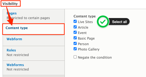
With all-new CSS, you may see unintended styling due to custom CSS you’ve added to your site. If you do, we strongly recommend unchecking the "Enable or disable custom CSS” checkbox in Appearance > Theme Settings > CUSTOM CSS to see if that fixes it. - Page Title Images
- If you have added custom content types to your site and they are listed in your THEMENAME.settings.yml file in this section:
page_title:

		allowed_types:

		- sf_page

		- sf_photo_gallery

		- MY_CUSTOM_CT
then you will need to- go to the Page Title block
- click its Configure button
- scroll to the Visibility section and click on the horizontal Content type tab
- Click the checkboxes to include all the active content types on your site, both your custom content types and the default types included with SiteFarm
- If you have added custom content types to your site and they are listed in your THEMENAME.settings.yml file in this section:
- Search Form
- The new design includes a modified search form that needs to be in the "Search" region. If you have a subtheme, you'll have to add two new regions to your subtheme's ".info.yml" file. The full region list should look like this: (note new regions in bold)
- header: Header
navigation: Navigation
quick_links: Quick Links
search: Search
pre_title: Pre Title
page_title: Page Title
pre_content: Pre Content
link_grid: Link Grid
top_content_first: Top Content 1
top_content_second: Top Content 2
top_content_third: Top Content 3
top_content_fourth: Top Content 4
content: Content
sidebar_first: First Sidebar
sidebar_second: Second Sidebar
bottom_content_first: Bottom Content 1
bottom_content_second: Bottom Content 2
bottom_content_third: Bottom Content 3
bottom_content_fourth: Bottom Content 4
footer: Footer
footer_credits: Footer Credits
- header: Header
- If you add these regions to your subtheme and deploy it to Live, your site will have the right blocks moved to the right places during the roll-out. If you wait until after the roll-out to add these new regions, you'll have to move the blocks manually.
- Post-deployment: If blocks aren't in the correct locations or your subtheme wasn't updated prior to the rollout, here are the regions and blocks to be manually placed:
- Search region
- Search block
- Pre-title region
- Primary Image Banner - Content block
- Block's Configuration: expand Content type label > set only for Basic page and Photo Gallery page types
- Primary Image Banner - Taxonomy block
- This region is also edge-to-edge so consider placing coronavirus messages, alerts, and hero banners in this location
- Primary Image Banner - Content block
- Search region
- The new design includes a modified search form that needs to be in the "Search" region. If you have a subtheme, you'll have to add two new regions to your subtheme's ".info.yml" file. The full region list should look like this: (note new regions in bold)