What is the Sibling Grid?
The Sibling Grid is a very basic layout option available as part of the default templated region layout system.
The SiteFarm team created an option called Sibling Grid that would allow you to line up two or three blocks side by side in a row prior to the release of Layout Builder and is configured through the settings in each block. Please note that this system is a legacy offering and we now recommend avoiding it in favor of the official Layout system. It is still available, but it's imperfect and better features are available to accomplish this type of layout.
Creating a Block Sibling Grid
Warning: blocks may not line up exactly as you envisioned as this is intended as a very simplified layout. Follow a row of two or three blocks with a full width "default" block, or with the alternate number of blocks. For example, if you start with a row of 2, make the next row 1 or 3 blocks.
The Sibling Grid layout system utilizes settings available from with each block instance as you attach it to the Content region. Users can set the options to:
- Default - 100% of the available width
- 1/2 - 50% of the available width, resulting in two blocks side by side
- 1/3 - 33% of the available width, resulting in three blocks side by side
It is vital that all the blocks in a given row share the same width setting or else your page layout will break.
Locating the settings
The configuration is done on the block related to the location and you have two methods for accessing it:
- In-context editing - If the block is already in place, you can hover your mouse over its upper right corner and click to Configure block, or
- Navigate to Shortcuts » Blocks or Manage » Structure » Block Layout and then locate your block in its assigned region and select the Configure button.
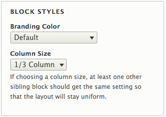
Configuration options
Once you have accessed the block, locate the Block Styles section (see Figure 1 above) and modify the Column size to your desired width.
WARNING: Multiple row of the same number (2 siblings followed by 2 siblings, or 3 siblings followed by a row of 3 siblings) will NOT work. You must alternate the number because the CSS code involved in creating this simple layout system, thinks you're trying to add percentages of width that add up to more than 100%. A 2 sibling row should be followed by a default width or a 3 sibling row to avoid this problem. When applying blocks to the Header and Footer regions ALWAYS set the column width to "Default". The system is designed and styled to configure these two regions for you. Applying a width will cause these sections to break and ruin its look.
Demo - 1/2 Setting

Demo - 1/2 and 1/3 Settings