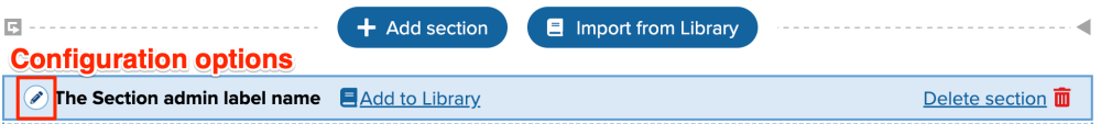
Each Section of your layout, represented by a blue bounding box with its own administrative label, contains a configuration option available from the pen icon in its upper left corner.
Available Settings
The configuration settings under Style this Section include three tabs: Layout, Appearance, and Section Styles.
Layout
- Optional Header Region
- checkbox - use if you would like to add an additional region where you can attach a block that includes a title or other text.
- Column widths - a drop-down menu provides the following options depending on which column setting you selected when creating your Section.
1 Column
100%
2 Columns
25% / 75%
33% / 67%
50% / 50%
67% / 33%
75% / 25%3 Columns
25% / 25% / 50%
25% / 50% / 25%
50% / 25% / 25%
33% / 34% / 33%4 Columns
Divided equally
- Column widths - Checkbox to Remove the gap between columns so that they touch.
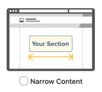
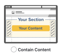
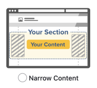
Horizontal containment - choose how to horizontally contain the content in this section. It's important to note that this will not do much visually unless your entire page layout is a full-page single column. In each of these illustration, you can see the positioning of Your Section (and its contained content) in relation to the dotted bounding box within which your content is contained by default. These settings let you override that containment as desired.
Legend:
Vertical blue dots are the default content containment widths
Your Section box with light yellow background is your Section and its content
Dark yellow horizontal arrow helps indicate the width setting in relationship to the default containment widths
Gray diagonal lines represent gutter spacing that exists inside your Section, forcing space between the content and the edges of its bounding box but still showing any background colors for that section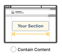
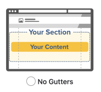
If the No Gutters option above is selected, additional Gutter settings will become available:

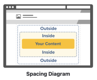
Vertical spacing - set the spacing values for the area outside of your section (top and bottom) and the space between this Section and any other sections or regions outside of itself, and inside the section above and below your content but still inside the specific Section's bounding area. These values are similar in effect to those used in the Layout Columns Widget, but are listed as:
- Default
- Small
- Medium
- Large
- Huge
- Vast
- Remove space
Use Advanced Spacing - fine-grain control is available to set each of these values on an individual basis for Top, Bottom, Left, and Right sides using the available checkbox.
Appearance
- Coloring - you can use the drop-down menu to select a color to be applied to the Section's background. While in Layout mode, it will seem like any blocks with text have lost their white background, but this will be returned when you Update your configuration and save your layout changes.
- Remove the default background color from blocks - checkbox - This is helpful if the block backgrounds in this section should be transparent. As noted above, the background for blocks is white by default, but this can interfere with colors and background image placements. By checking this box you will then be prompted to indicate:
- Dark text on light background, or
- Light text on dark background
- Remove the default background color from blocks - checkbox - This is helpful if the block backgrounds in this section should be transparent. As noted above, the background for blocks is white by default, but this can interfere with colors and background image placements. By checking this box you will then be prompted to indicate:
- Background image - Allows you to upload a new image to be used in the Section's background; access to your Media Library is not available.
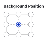
Background Position - Select the radio button button corresponding with where the image should be position in the Section's container.
Background Size - select from three possible sizing options:
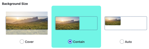
- Cover - ensure the image will fill the entire Section background, but be aware that cropping is likely to occur if overly large, or pixelization if the image is too small and gets stretched.
- Contain - fits the entire image within the Section background, but is not guaranteed to fill the Section's full width depending on the image's dimensions.
- Auto - places the background image into the Section's background and allows the image's default size to dictate how it fills the space.
Section Styles
- Boxed Offset - Box in the links and pull them up to overlay the preceding section above. (Notice: the full offset will not take place in the Layout preview to avoid covering layout controls.)
- Add a custom CSS class - for those who know how to write CSS, you can add a custom class that can then be referenced from either your CSS Editor or a custom subtheme.