What is the Layout Columns Widget?
This widget, available from the WYSIWYG's icon bar, gives you the ability to insert a box row containing up to a maximum of four columns. Configuration settings provide a variety of column width options along with style options for how the box is presented on the page to give it visual splash.
How to insert a Layout Column
- Edit a page or block that contains a WYSIWYG textarea.
- From the WYSIWYG's icon bar, click on the Widget menu icon:
- From the Widget menu list, select Layout Columns

Configuring your Layout Column
When you create your Layout Column, a popup window will ask you to define how many columns to include.
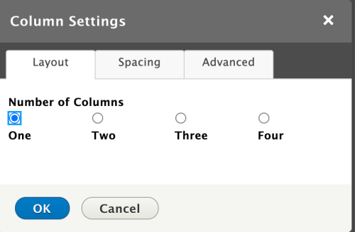
If you choose to have two or more columns, the popup window will update to allow you to define the width distributions from these presets.
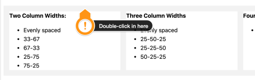
Two Column Widths:
- Evenly spaced
- 33-67
- 67-33
- 25-75
- 75-25
Three Column Widths
- Evenly spaced
- 25-50-25
- 25-25-50
- 50-25-25
Four Column Widths
- Evenly spaced
Above: layout column using the 3 columns, evenly spaced option.
Layout Column Spacing
The feature includes ways to customize spacing between columns as well as spacing in relationship to the content around the container itself.
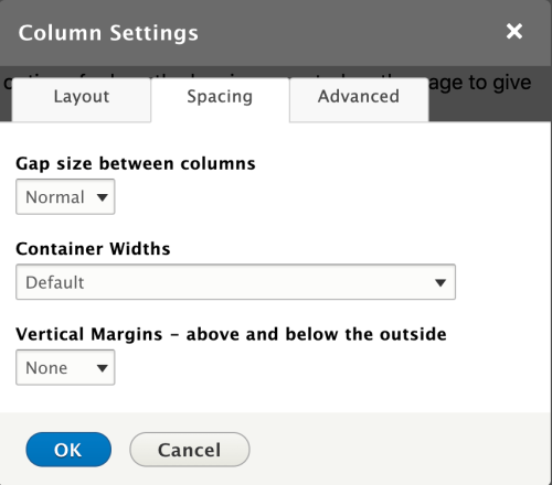
Gaps size between columns
- None
- Tiny
- Small
- Normal (default)
- Medium
- Large
- Huge
Container Widths
- Default
- Fits within the default width of the block or page's content area.
- Shrink
- Reduces the width of the container.
- Overflow
- Breaks out of the container and overflows the body content area slightly.
- Edge to Edge (not to be used on pages with sidebars)
- Pushes the container's sides to the full width of the screen's vertical edges.
Vertical margins
- None
- Tiny
- Small
- Normal (default)
- Medium
- Large
- Huge
Above: layout column using the 3 columns, 25-50-25 option.
Can I change the configuration after I create it?
Yes. To apply changes to your existing Layout Columns widget, edit your page, located your column row, and then double-click in any of the gray bounding box surrounding your column content.
Any other tips for me?
Yes. If you're adding both images and text to the same column, make certain to add the text FIRST. If you add the images first, the Media Library makes it almost impossible to move your cursor's insert point beneath the image without going into your page's Source screen to manually enter text into the page.
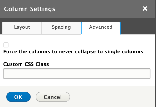
Layout Columns Advanced
Not your parental unit's CSS
Since the Layout Columns feature is a web component, it can't be styled with a basic class like you might create for other parts of your site. Instead, you'll need to become familiar with the ::part() pseudo class. Find out more from the MDN Web Docs write-up.
"Parts" that you can target:
- base - the main container
- row - the wrapper around the individual columns
- column1 - first column
- column2 - second column
- column3 - third column
- column4 - fourth column
So to add a background color on Layout Columns with a custom class of "custom-class" you would do the following:
.custom-class::part(base) {
background: blue;
}
This feature includes the ability to customize it still further by applying your own custom CSS class, which can then be defined in either your site's CSS Editor or through your custom subtheme. In special circumstances, you may want to prevent the mobile design setting from applying the stacking effect for a better user experience on small screens and smartphones, provided of course that the text and/or images will display appropriately if you prevent the columns from collapsing as otherwise designed.
Demo Examples
Need a more versatile version of the Teaser Link Box?
This is your answer. You have the full power of the WYSIWYG along with the ability to insert multiple links in your text in this space.
UC Davis, SiteFarm, Gooooooooogle.
Some lorem ipsum for filler: Lorem ipsum dolor sit amet, consectetur adipiscing elit, sed do eiusmod tempor incididunt ut labore et dolore magna aliqua.
Above: layout column using the 2 columns, 25-75 option. Spacing: Gap - normal, Width - default, Vertical space - none.


Above: layout column using the 4 columns, evenly spaced option. Spacing: Gap - large, Width - default, Vertical space - normal.
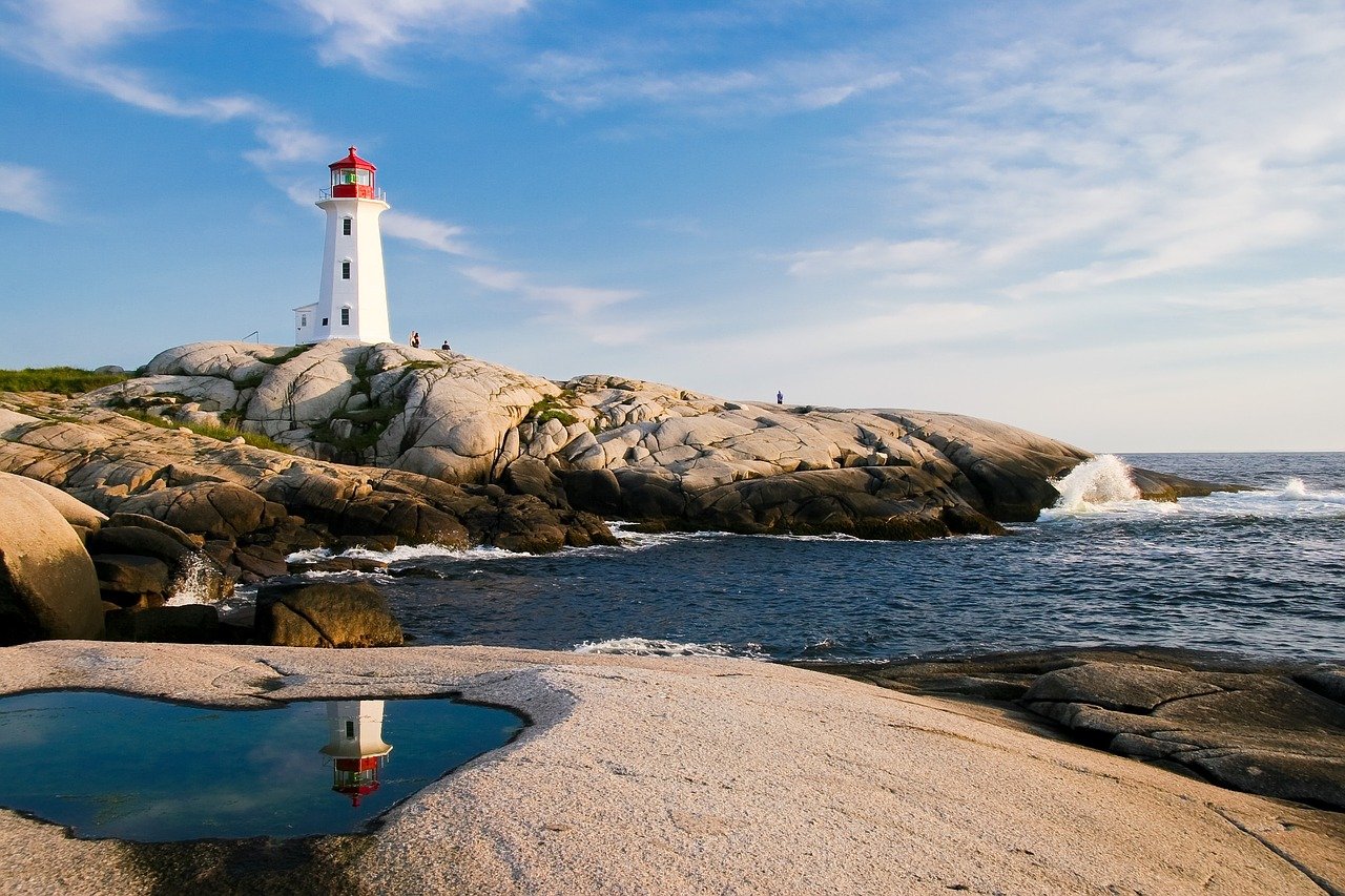
Ready to Get Away?
Jane Doe
It's been too long and folks are making plans for getting out and away. Skip the crowded tourist spots and over-visited locations and spend your time where the sky meets the sea instead. Tours, accommodations, great food, and countless activities await you in our Lighthouse tour packages up and down the New England coast. Great excursions for couples and families alike!
Above: layout column using the 2 columns, 67-33 option. Spacing: Gap - huge, Width - overflow, Vertical space - large.
Title One
Lorem ipsum dolor sit amet
Title Two
Consectetur adipiscing elit, sed do eiusmod tempor.

Title Three
Duis aute irure dolor in reprehenderit.
Above: layout column using the 3 columns, evenly spaced option. Spacing: Gap - normal, Width - shrink, Vertical space - medium.
Important: add your text first, then your images; to do otherwise means you will have difficulty inserting your text after the fact.

Above: layout column using the 1 column, Gap - none, Width - edge-to-edge, Vertical space - medium.