 | Undo or redo an action |
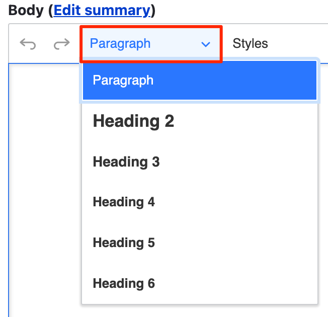 | Apply a semantic Heading level to text |
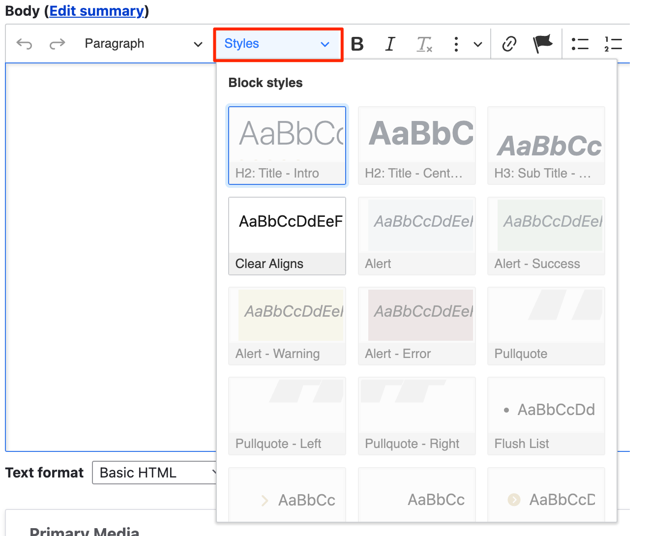 | Apply one or more Styles to text to create headings, buttons, and lists - Apply a Button style to linked text. Note multiple styles may need to be selected in order for it to display the way you want.
|
 | Highlight text and click the B icon to make it bold |
 | Highlight text and click the I icon to make it italic |
 | Removes formatting (bold, italics, hyperlinks, etc) from content |
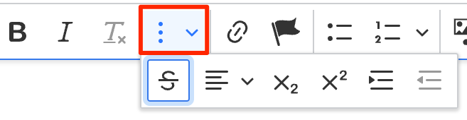 | Text Extras menu which includes:  - Strikethrough text format - Strikethrough text format - Text highlighter with submenu - Text highlighter with submenu - Text alignment, left, right, and center - Text alignment, left, right, and center - Subscript - Subscript - Superscript - Superscript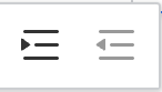 - Indent will move the paragraph inward to the right one tab space, while Outdent will move the text outward to the left one tab space until it hits the content margin edge - Indent will move the paragraph inward to the right one tab space, while Outdent will move the text outward to the left one tab space until it hits the content margin edge
|
 | Insert links to internal or external content, email addresses, anchor points and more. 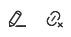 - Click the link you embedded to reveal a submenu that allows you to edit the link or delete it - Click the link you embedded to reveal a submenu that allows you to edit the link or delete it
|
 | Insert and link to anchor points |
 | Insert bulleted list - (Fixing spaces that show up in your lists) |
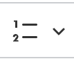 | Insert numeric list - (Fixing spaces that show up in your lists).
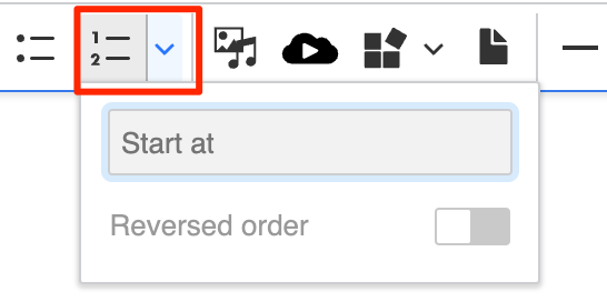 - Users can set the "Start at" number and choose to reverse the count order. - Users can set the "Start at" number and choose to reverse the count order. |
 | Insert from Media Library into the WYSIWYG region. |
 | Insert media via a URL, such as a YouTube or Aggie video |
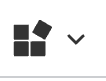 | Widget menu. Use this drop-down menu to access the following features:  - Layout Columns widget - Allows users to create in-body layout options with from 1-4 columns with a variety of margins, spacing, and styles. - Layout Columns widget - Allows users to create in-body layout options with from 1-4 columns with a variety of margins, spacing, and styles. - Teaser Link Box - Creates a clickable area that can include an image, caption, title, and text to link to internal pages or to external sites - Teaser Link Box - Creates a clickable area that can include an image, caption, title, and text to link to internal pages or to external sites - Feature Box - Provides a formatted title and text area to spotlight and feature a segment of content in your body text - Feature Box - Provides a formatted title and text area to spotlight and feature a segment of content in your body text - Alert Message - Accessible alerts designed specifically for timely messaging, four colors and optional color-specific icon - Alert Message - Accessible alerts designed specifically for timely messaging, four colors and optional color-specific icon - Brand Textbox - A textbox with four available colors from the official branding palette intended for visual emphasis - Brand Textbox - A textbox with four available colors from the official branding palette intended for visual emphasis
|
 | Insert file documents, such as .doc, .xsl, .pdf, etc. |
 | Horizontal line break |
 | Pull Quotes - Apply the blockquote style to your highlighted text |
 | Code formatting |
 | The Show More section includes the following feature options:  - AI Assistant - use prompts to either have AI generate new content or modify existing content for you based on your specified input - AI Assistant - use prompts to either have AI generate new content or modify existing content for you based on your specified input - Insert Table - NOTE: TABLES SHOULD ONLY BE USED FOR TABULAR DATA! - Insert Table - NOTE: TABLES SHOULD ONLY BE USED FOR TABULAR DATA! - Special Characters - WYSIWYG characters, special unicodes for subscripts, superscripts, and how to include proper accents - Special Characters - WYSIWYG characters, special unicodes for subscripts, superscripts, and how to include proper accents - Footnotes - insert a footnote or citation to create an automatically styled and positioned footnote at the bottom of your page. - Footnotes - insert a footnote or citation to create an automatically styled and positioned footnote at the bottom of your page.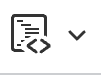 - Insert code block - Insert code block - History log revert lets you backtrack through your page's version history of changes. While in your current logged-in session you will have the ability to restore an earlier version of your document to easily reverse any changes. Save point entries will be available from the icon and list them in chronological order from newest to oldest. It autosaves to the browser's local storage and is per editor instance. So each editor on a page has their own revision history. By default it only holds onto revisions for up to one day. This tool is meant more for disaster recovery in the event that someone has been writing a long article and suddenly loses it all. Everything in the editor can be recovered. This will be separate from your page's Revisions tab and specific to the content added inside of the WYSIWYG. - History log revert lets you backtrack through your page's version history of changes. While in your current logged-in session you will have the ability to restore an earlier version of your document to easily reverse any changes. Save point entries will be available from the icon and list them in chronological order from newest to oldest. It autosaves to the browser's local storage and is per editor instance. So each editor on a page has their own revision history. By default it only holds onto revisions for up to one day. This tool is meant more for disaster recovery in the event that someone has been writing a long article and suddenly loses it all. Everything in the editor can be recovered. This will be separate from your page's Revisions tab and specific to the content added inside of the WYSIWYG. - Insert HTML allows the addition of code snippets into the body of the WYSIWYG directly into the flow without requiring the text format to be changed from Basic HTML to Full HTML. Please note that only tags normally allowed in Basic HTML will be permitted; CSS styles, for example, will be stripped out on Save. - Insert HTML allows the addition of code snippets into the body of the WYSIWYG directly into the flow without requiring the text format to be changed from Basic HTML to Full HTML. Please note that only tags normally allowed in Basic HTML will be permitted; CSS styles, for example, will be stripped out on Save. - View WYSIWYG area source code. Uncheck the Source button to return to your regular Editing view. - View WYSIWYG area source code. Uncheck the Source button to return to your regular Editing view. - Full screen mode, allowing you to enlarge your WYSIWYG workspace and temporarily hide other page elements for a streamlined work environment. Uncheck the full screen icon to return to the regular view. - Full screen mode, allowing you to enlarge your WYSIWYG workspace and temporarily hide other page elements for a streamlined work environment. Uncheck the full screen icon to return to the regular view.
|
| | |
