
Take in the View: Making a custom recent article block
This isn't a step-by-step how-to; scenarios vary far too much for things to be identical and a certain amount of basic Views knowledge is required for this to make sense. If this topic is entirely new to you, take some time to learn about Views first. These write-ups are meant to show you what's possible so we can set free your imaginations to discover new methods for presenting your content to the world.
Project Scope
We recently had a request from a user asking how she might have more control over how recent articles are listed in a block. Display the author on this version, display more teaser info on that one, and so on. This View walk-through will show you how you can take the available field entities and assemble them to output exactly the available default information to whatever degree you prefer and use it as a stepping stone to more custom work.
Project Outline
- Include the following from the Article content types
- Primary image
- Title
- Author name
- Authored on date
- Teaser/body snippet
- Branding details
- Sort the output by Authored on date, descending order
- Display only published Articles
- Make the primary image a thumbnail and display the branding color bar for it, if assigned
- Make the title a link to the related content
- Make the block responsive
Necessary Components
- At least a handful of published Articles to test your output
- A single View with at least one Block display mode (your number may vary depending on how many versions you would like to use on your site)
- Custom Block output using replacement patterns or tokens
- Create additional versions with modifications
- A link to SiteFarm PatternLab code/style guide
A single View with at least one Block display mode
- Navigate to Manage » Structure » Views.
- Click the + Add View button.
- Provide the following:
- View Name
Example: "Custom Recent Articles" - Description - this will be helpful if anyone else is working on your site at this level and needs a quick glance aid in knowing what this View is meant to do.
Example: "An alternate block with more granular field option settings for choosing to display specific elements available from Articles" - View Settings - set this for:
- Content of type Article tagged with <blank> sorted by <Newest first>
- Block Settings - check
- You can set the Block Title now if you want, or leave it blank
- Page Display Settings - Unformatted list | Fields
- View Name
- Click Save and Edit to finish.
Custom Block output using replacement patterns or tokens
Whether you're planning on having a single display mode output or several, it's easiest to start with the version that contains the most complete version of the elements you want to show on the page. Afterward, you can duplicate the display mode and remove the sections you want to skip.
Custom Block Display Names
Once you've created your initial View structure, you can move on to configuring its settings. Let's start with supposing that you will eventually have few versions of this block you want to display, perhaps on separate pages. This means each block in your View will need its own Block Display. If you look under the Display title you'll see:
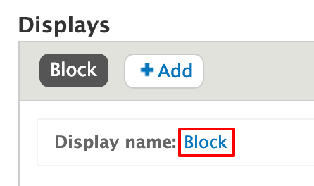
- Click on the Block text next to "Display name."
- In the dialog box that appears, provide a distinctive Administrative name.
Example: "Full version" - Click Apply.
- Click Save.
Build a Relationship to branding taxonomy
- In your View, expand the Advanced label in the third column on the right.
- Locate the Relationships section and click the Add button.
- Search for 'Taxonomy' and check the box for the entry reading "Taxonomy term referenced from field_sf_article_category"
- Click the Add and configure relationships button.
- Do not make the relationship required. Click Apply to finish.
- Click Save to save this View change
Configurations
TITLE
- Title that will display on the block
FORMAT
- Grid » Settings: use the defaults with no changes
- Field » Settings: use the defaults with no changes
FIELDS
- In the Fields section, click the Add button and select the following options:
- Title : Content
- Authored by : Content
- Authored on : Content
- Summary: Content
- Body : Content (set to summary)
- Primary Image : Content
- Branding color : Taxonomy
- Custom text : Global
- Click the Add and configure fields button.
- Configure the fields as follows for the example, but note that you can make any changes you wish to customize your output. After each, click Apply and continue.
- Title
- Check: exclude from display
- Authored by
- Check: exclude from display
- Uncheck: Link label to the referenced entity
- Authored on
- Check: exclude from display
- Summary
- Check: exclude from display
- Body
- Check: exclude from display
- Formatter menu: set to Summary or Trimmed
- Trimmed limit: 140
- Primary image
- Check: exclude from display
- Formatter: Thumbnail
- Image style: Thumbnail
- Link image to: Content
- Style settings
- Check: Customize field HTML
- HTML element: use default
- Check: Create a CSS class
- CSS Class: image-style-sf-thumbnail
- Branding color
- Check: exclude from display
- Custom text
- Style settings
- Check: Customize field and label wrapper HTML
- Wrapper HTML element: SECTION
- Check: Create a CSS class
- CSS Class: article-list
- Style settings
- Title
- Click Save to save your progress.
Building your output in the Custom Text field
- In order for this project to work, it's essential for the Custom text field to be the very last entry in the list. If necessary, click on the downward arrow next to the Field's Add button and choose Rearrange.
- Drag and drop the Custom text field in the last position below all the rest of the field entries. We do this to make sure the information in those fields are entered in the specific order so the Custom text field can "see" them all. If any fields are listed after Custom text, the information they contain won't be accessible to our Custom text field.
- You will be creating a combination of HTML, CSS, Token Replacements, and Twig entries. Click on the Custom text field and paste the following into the Text field as a starting point example:
<article class="vm-teaser category-brand--default u-space-my">
<div class="vm-teaser__figure category">
<a href="#" class="category-brand__thumbnail">{{ field_sf_m_primary_media }}</a>
</div>
<div class="vm-teaser__body">
<h3 class="vm-teaser__title">{{ title }}</h3>
<ul class="vm-teaser__byline">
<li><span class="byline">by {{ uid }}</span></li>
<li>{{ created }}</li>
</ul>
<div class="vm-teaser__summary">{{ field_sf_article_quick_summary }}{{ body }}</div>
</div>
</article>Explanation of the code
{{ token }}
--the curly braces denote a Replacement Token, which is a placeholder for information held in the content field for that token. As the system loops through the available content, it replaces the token with the actual title, author, date, etc. The token is required for to allow for the dynamic population of information to your block if you want it to update automatically as you create new content on your site.
HTML/CSS example <div class="vm-teaser__summary">{{ field_sf_article_quick_summary }}{{ body }}</div>
--The structure for our output is taken directly from SiteFarm's PatternLab instance, in this case for a teaser listing. - Click Apply to finish.
Create additional versions with modifications
Once you've created your first full block display mode, you're now in a position to riff off the original, deciding if you want to streamline the entries by omitting the teaser, or perhaps the primary images.
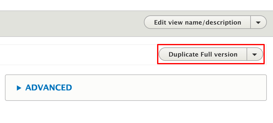
Create a new version from your existing full version:
- Edit your View and look over on the right-hand side of the screen. Two drop-down menus are available. The top one has options for the entire view. The bottom one has options for the specific Display Mode you're viewing. Use the bottom one and select Duplicate <name of your display mode> from the menu.
- The system will update the list of Display Modes, in this case duplicating the entire Display Mode view you created, including its name. You can rename this Display by clicking on the Display name's name link.
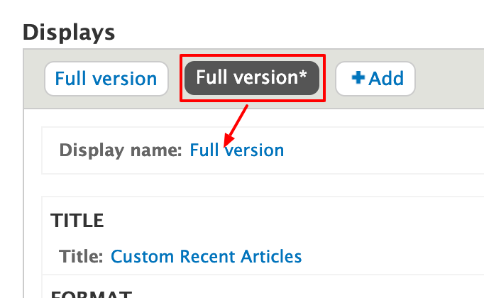
- A dialog box will open and allow you to change the name and provide a description. Apply the changes
- Save your View.
- Edit your View and navigate to your second Display mode to begin making your new version. It is essential to change All displays to This block (override) or else you'll be applying any changes you make to every single Display mode version, undoing previous work. When done, save your changes.
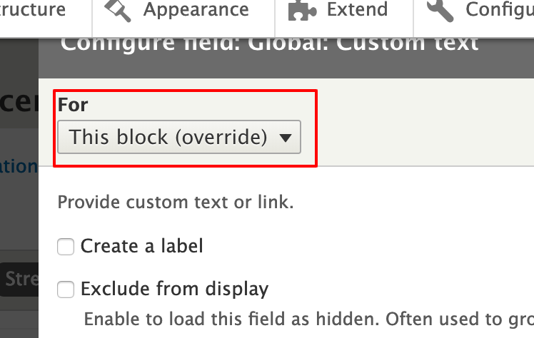
Avoid extreme sadness by triple-checking that you've set the changes to "This block (override)." - The blocks attached in the second sidebar of this article are created from our first, titled Demo 2 and Demo 3. Both started with all the original code we added, before having any references removed. You, too, can customize your work, whether to adjust the code provided in this example or get creative in what content is called via tokens and what styles—from Patternlab or of your own making in CSS Editor—you decide to create and add, you have a powerful tool for expressing your site's message to your audience.